Birla HIL – Launch of New Range of Products
The Objective:
Strengthened by a rich legacy of over 75 years and proven industry leadership, BIRLA HIL, part of the CK Birla Group, is in pursuit to innovate and enhance the product portfolio of comprehensive building materials.
Team Tempest was commissioned to create a smart launch campaign for Riverview City.
The Challenge:
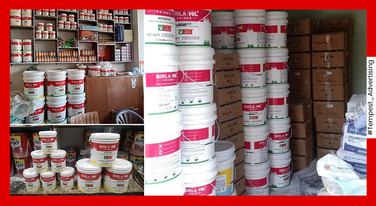
For each product category, HIL sought to create an identity that’s unique and yet would illustrate Birla Group’s legacy. A detailed study of the HIL categories, market dynamics, product placement vis-a-vis competition was conducted. One of the key aspects that came upon in the study was that outlets are multiproduct multi-brand, and are usually cramped for space.
The Solution:
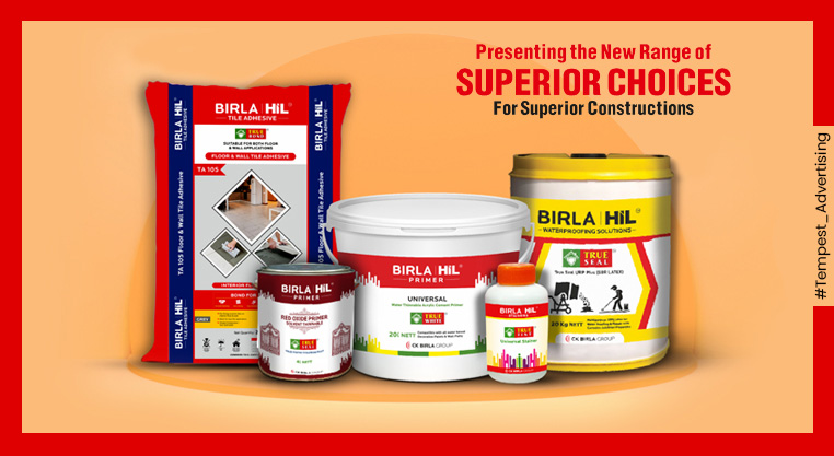
Following a few rough sketches and ideation exercise, Team Tempest came up with an unmissable visual identity that stood out from the maddening crowd of products. New visual identity was created using a Triadic colour scheme. Red, and yellow, as dominant colours, and green and white as secondary. These primary colours gave a solid, distinctive look to the product. The logo was created with a mix of typography and mnemonics rendering a perfect balance of colours.
THE Result:
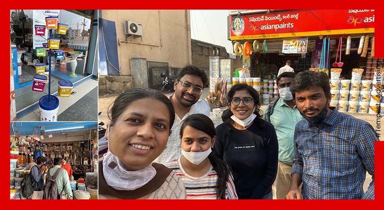
The products are launched in the markets. Post production we have received positive feedback from our client and their channel partners. The packaging has successfully managed to create a unique visual identity.