
SAMAGRA The Build Zone
Objective
Create a visual identity that reflects a hub for construction. The identity needed to resonate with the mindset of a Tier 2 audience and at the same time reflect the company’s vision and purpose.
Project Overview
Sri City Enterprises, a well-established construction materials retailer in Sattupally, Telangana, envisioned a significant transformation from operating a small-scale store to launching a 40,000 SFT mega construction retail destination. The ambition was not merely expansion in size, but elevation in perception. The new venture needed a powerful brand name and identity that could reflect scale, authority, and completeness in a competitive yet culturally rooted Tier-2 market.
The objective was clear: create a brand that positions the store as an end-to-end construction hub offering everything except sand and aggregates from cement, steel, paints, sanitary ware, plywood, electricals, pipes, fittings, and more all under one roof.
The Core Challenge
Designing for a Tier-2 town like Sattupally required more than aesthetics it demanded cultural sensitivity and strategic clarity. The primary audience consisted of Telugu-speaking retailers, contractors, builders, and individual homeowners who value trust, familiarity, and tradition.
The client expressed a strong desire for the brand to subtly reflect a Hindu religious aspect while maintaining a modern and professional outlook. The challenge was to balance cultural symbolism with contemporary design, ensuring the identity felt rooted yet progressive. At the same time, the logo needed to visually communicate the idea of “all-in-one completeness” the very foundation of the business model.
The client was initially uncertain about the visual direction but was clear about one expectation: the logo must convey wholeness and construction relevance.
Brand Naming Strategy
The name “Samagra” was derived from Sanskrit, meaning “complete,” “entire,” or “whole.” This name perfectly encapsulates the store’s core proposition: a comprehensive destination for every construction need.
Beyond meaning, the name carried strong strategic advantages. It resonated culturally with the Telugu audience, felt rooted in Indian ethos, and projected authority and scale. It was easy to pronounce, memorable, and distinctive within the construction retail category. By choosing “Samagra,” the brand positioned itself not as a hardware shop, but as a complete construction ecosystem.
The tagline “The Build Zone” further strengthened this positioning, reinforcing the idea that this is not just a store, but a dedicated construction destination.
Logo Concept & Symbolism
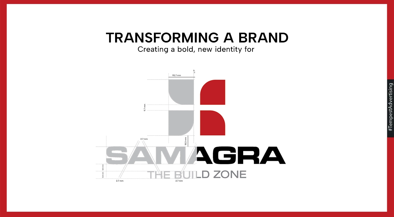
The logo was designed around the philosophy of completeness through structure. The monogram consists of four tile-like geometric forms arranged symmetrically. Individually, each form appears strong and stable; together, they create a unified and balanced symbol visually representing the idea of components coming together to form a whole.
In the negative space between these forms, a subtle Swastik structure emerges. The Swastik, a sacred Hindu symbol, represents prosperity, positivity, and auspicious beginnings. Rather than explicitly depicting it, the symbol was intelligently embedded into the white space, allowing cultural meaning to exist without overpowering the modern aesthetic. This subtle integration ensured emotional resonance while preserving sophistication.
The four-form structure also resembles construction tiles or interlocking building units, directly connecting the brand to its industry. The motif was further designed to be extendable usable as borders, overlays, and recurring graphic elements across store branding and communication materials.
Color & Typography Strategy
The primary orangish-red palette was chosen for both symbolic and practical reasons. Red conveys energy, prosperity, and strength ualities strongly associated with construction and growth. In a Tier-2 retail environment, where storefront visibility is critical, the vibrant tone ensures high recall and roadside impact.
Supporting black and grey tones add balance and seriousness, grounding the identity within the construction category. The typography, with its harmonious thick and thin strokes, communicates sturdiness while maintaining a modern sensibility. The bold uppercase treatment of “SAMAGRA” ensures strong visibility across large-format signage and communication platforms.
Brand System & Deliverables
The identity was developed as a complete brand system rather than a standalone logo. Deliverables included brand naming, primary and secondary logo variations, logo structure and measurement guidelines, color palette definition, typography system, do’s and don’ts, corporate stationery, and open files for implementation.
The four-pattern motif was intentionally designed to function as a mnemonic device across physical and digital applications, ensuring consistency and scalability as the brand grows.
Outcome & Impact
After presenting two distinct concept directions and engaging in strategic discussions, the final identity successfully aligned with the client’s vision of an “all-in-one” construction destination. The logo achieved a balance between tradition and modernity, making it culturally relatable while projecting scale and professionalism.
SAMAGRA now stands as a strong retail identity in Sattupally, visually communicating completeness, structural strength, and trust. What began as a small local enterprise has evolved into a structured, scalable brand with clear positioning and strong market recall.
